Case Study · Third Room Co-Working
Building a co-working website that turns browsers into members.
Challenge
The space was exceptional. The website wasn't telling that story.
Third Room is a thoughtfully designed co-working space built around community, focus, and flexibility. But their existing web presence was generic — a template site that failed to communicate what made the space special, and converted very few visitors into members or even inquiries.
The core challenge: how do you translate a physical feeling — the warmth of a good workspace, the energy of a focused community — into a website that compels action?
High traffic, low conversion — visitors bounced without reaching the membership page
No visual identity — the site looked like every other co-working template online
Missing the story — the community and culture that made the space worth joining wasn't shown
Discovery
We started by understanding who actually joins a co-working space — and why.
Our research started with a simple audit: go over the current site and note what it does. The pattern was clear: hero with a wide-angle desk shot, three pricing tiers, a testimonials row, a contact form. Organised around what the owner wants to show — floor plans, amenities, membership options — rather than what a visitor is actually trying to feel out.
We mapped the full conversion funnel and identified three critical gaps: the site didn't show the space at its best, it didn't speak to the right audience (freelancers and small teams, not enterprise), and there was no clear, low-friction path to taking the next step.
Key discovery
"People don't book a co-working space after reading about amenities. They book it after they can picture themselves there."
Strategy
Show the feeling first. Earn the conversion second.
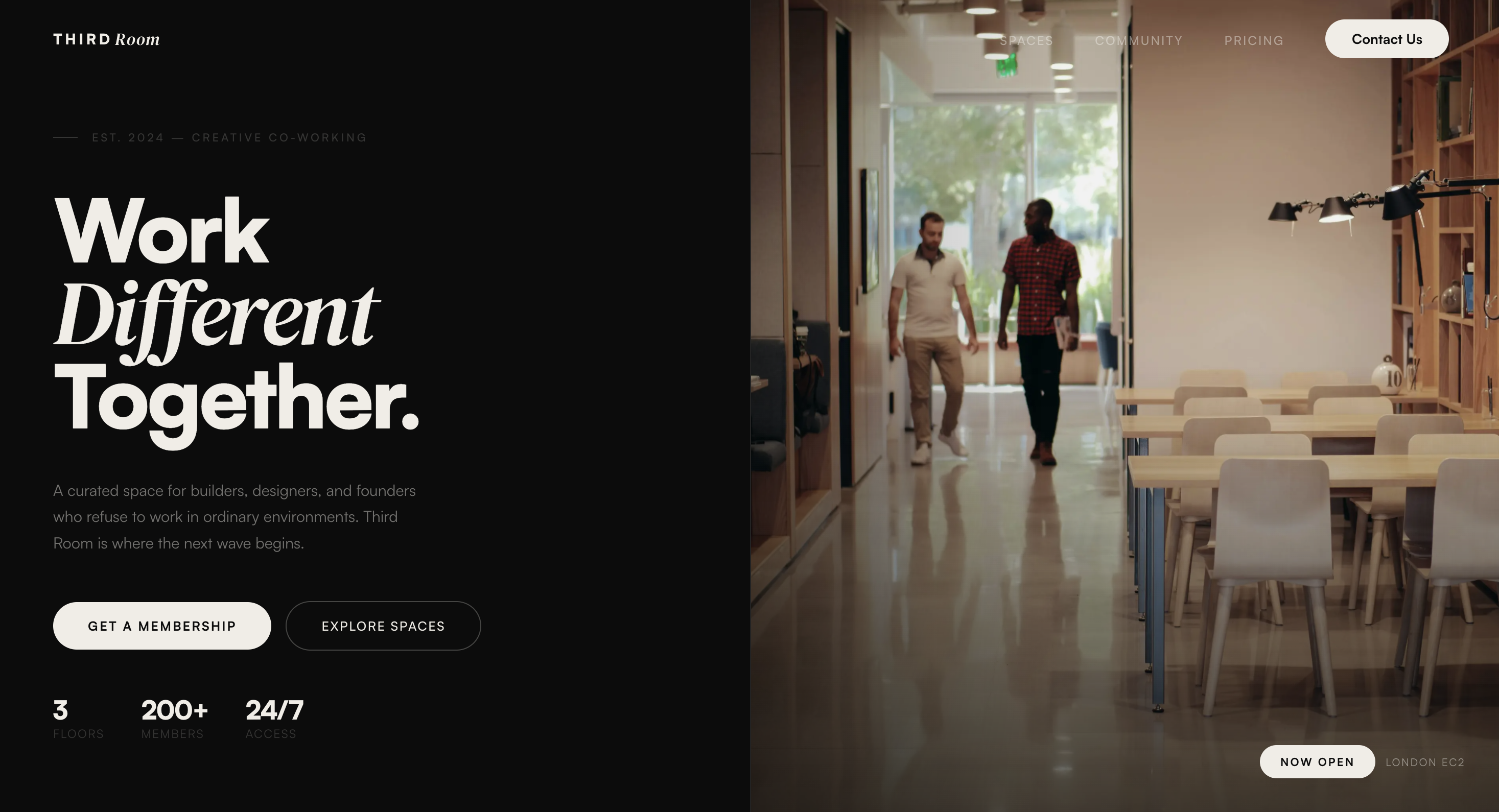
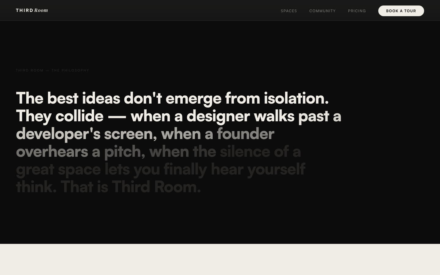
The strategy was built around atmosphere before information. The hero section leads with full-bleed imagery that communicates warmth, focus, and community — before any copy tries to explain it. Scroll animations are deliberately unhurried, giving visitors space to take it in.
We simplified the information architecture to three goals: make the space feel desirable, answer the key questions (pricing, amenities, location), and make the next step obvious and easy. Every section was designed in service of one of those three jobs.
Atmosphere first
Full-bleed imagery and slow scroll animations set tone before any copy loads.
Community-forward copy
Language shifted from features to belonging — speaking to freelancers and small teams directly.
Frictionless CTA
A persistent, minimal contact prompt replaces the buried form that was losing conversions.
Performance-focused build
Built with Next.js, optimised images, and minimal JS to ensure fast loads on any device.
Outcome
A site that finally felt like the space itself.
The redesigned site launched with a clear visual identity, a narrative structure that mirrors how people actually decide to join a co-working space, and a conversion path that doesn't get in the way. Visitors stay longer, scroll further, and reach out more.
More than the metrics, the client felt the site finally matched the care they put into the physical space. That alignment — between the experience of being there and the experience of discovering it online — was the real outcome.